The primary goal of the redesign project was to create a more developer-friendly experience, with all new content and a completely new look and feel to support our updated product offerings. I made creative decisions based on data from our top-performing LinkedIn ads, and partnered closely with the Head of Product Marketing and the Web Program Manager to complete this extensive overhaul on time, within just one quarter.
Role: Head of Creative and Brand
Results: Visits increased 28.8%, and sign-ups went up significantly per page, with the highest being 777.8%. Engagement (duration) increased, with the highest being 59.0%.
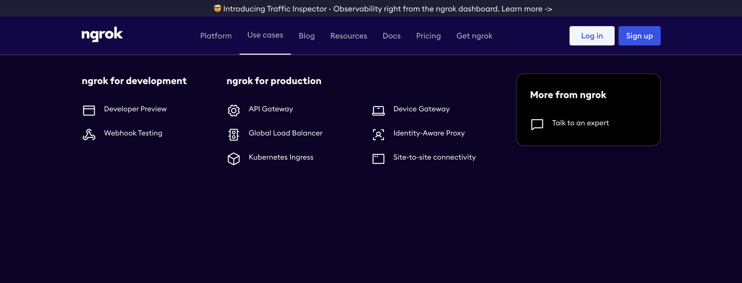
I redesigned the main pages of the site to dark mode to align with our developer-first strategy, and updated the typography to include a code font. The new homepage lists out all of the new Development and Production use cases.
Use cases are now divided into Development and Production for straightforward navigation. Icons were updated to align with the ngrok Product.
I designed 10 new use case pages with illustrations to make each use case unique. Site-to-site connectivity example ↗️
I designed 10 updated diagrams in dark mode, and partnered with Product Marketing to ensure technical accuracy.
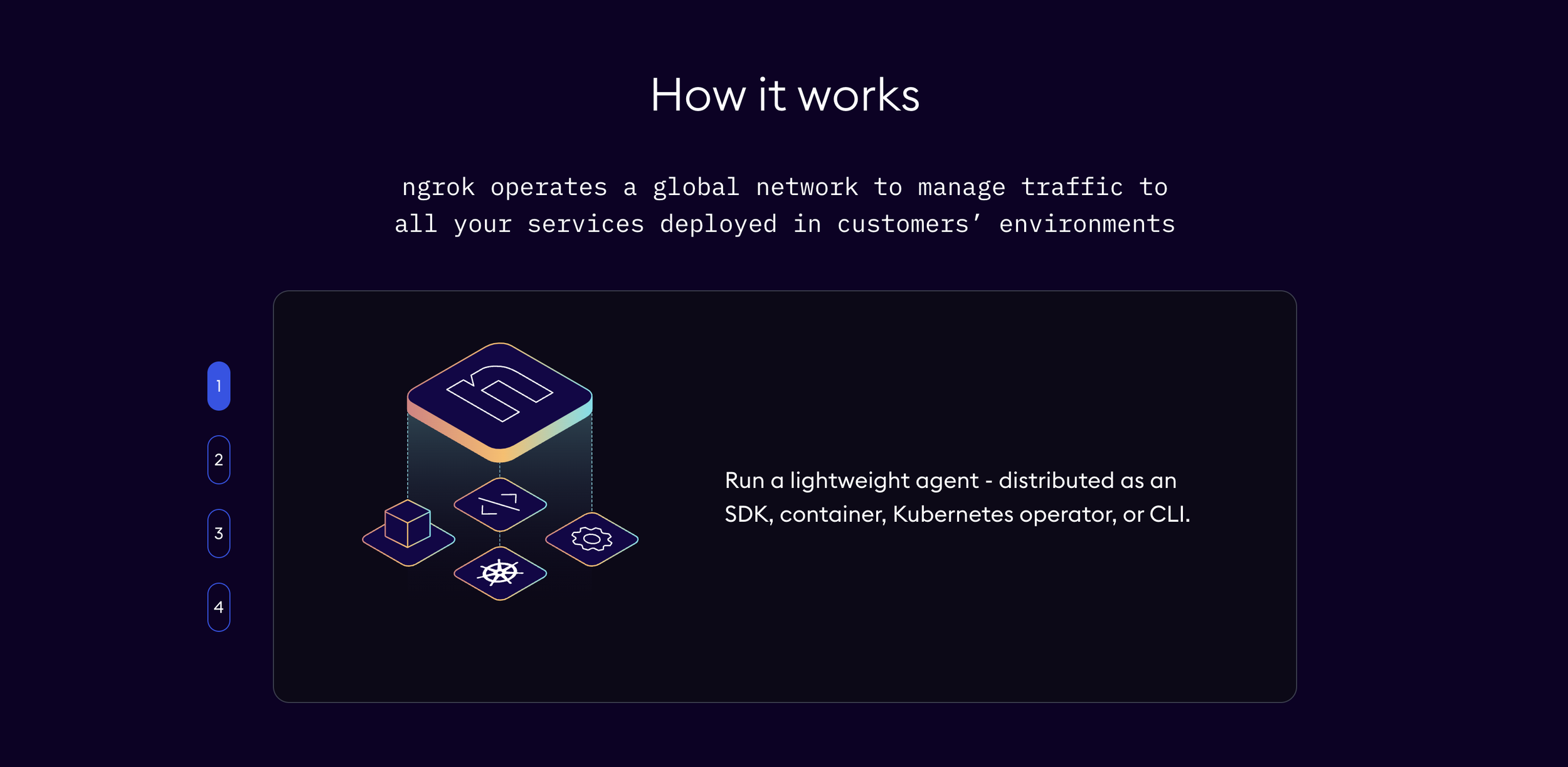
A new "how it works" carousel on each use case page helps users understand how ngrok technology operates within their environment. I designed 3-4 illustrations per carousel to support the text.
The illustrations add interest to the page and leverage the icons used on the homepage. They are abstract representations of each tech stack.
I drew this custom illustration for a Spotify playlist that ngrok developers created: Beats to Network to. The inspiration was the famous Lofi Girl. I drew a developer at her computer, in cozy coding mode, looking out at the Seattle skyline at sunset. Her cat was inspired by a teammate's cat. Everything is going to be 200 ok! ☕
Role: illustrator
Webinars are an important channel for ngrok, to connect with the developer community, dive deeper into technical concepts, and gain new prospects.
Role: Head of Creative and Brand
Results: ~200 registrations per webinar
The branding I created for the Developer Roundtable revolves around the live conversations between hosts and the dev community. The Office Hours webinar is an open forum to submit questions and have them answered live, so I added an open laptop in the same style as the first webinar. It was important to me that each webinar has a unique — but still connected — brand identity.
We promote the webinars throughout the site on these page banners. The rainbow gradient fits in seamlessly with the new site design.
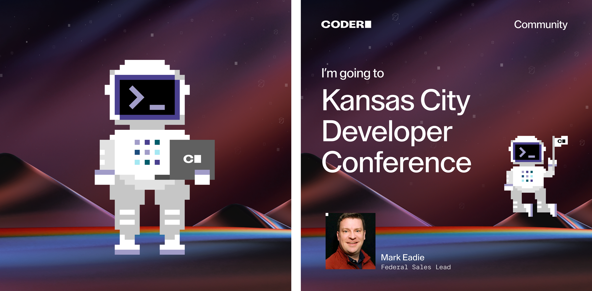
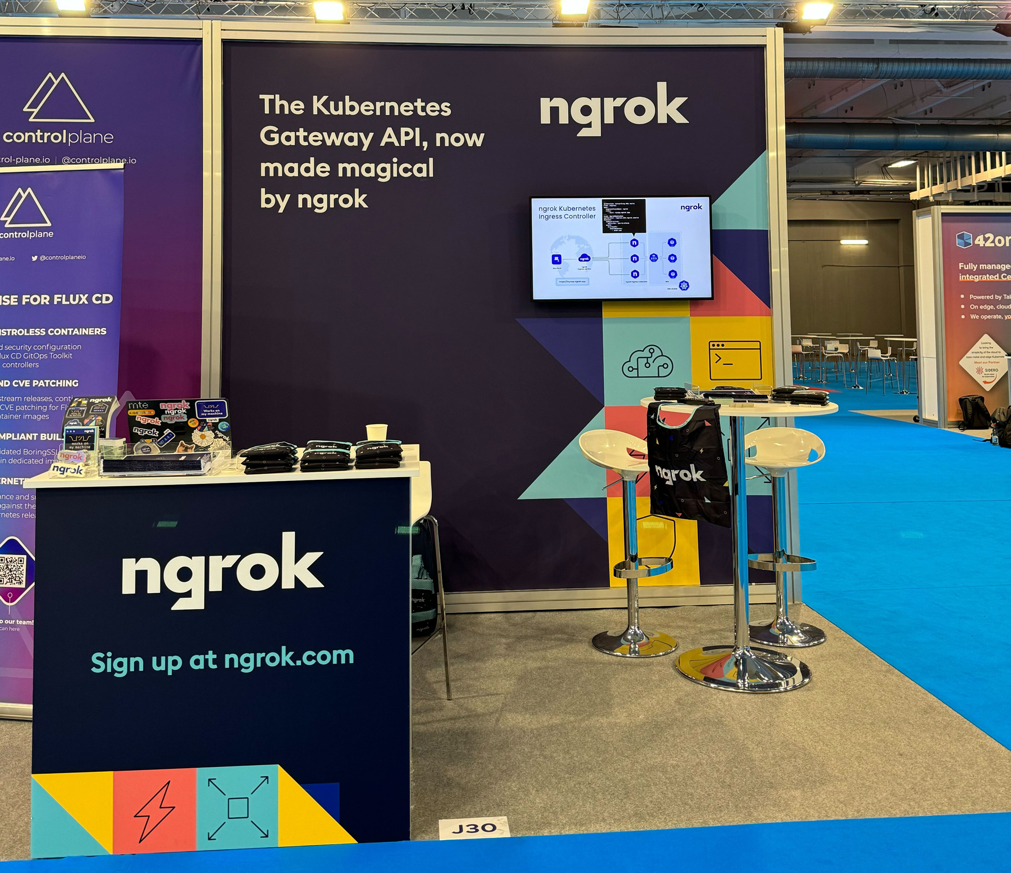
The ngrok booth presence at KCDC 2024 (Kansas City Developer Conference) was a large 20x20 space, which gave me tons of fun creative projects to tackle including banners, counters, a coffee bar, pillows, stickers, and a handout.
Role: Head of Creative and Brand
Results: ~600 badge scans at KCDC
Since the booth was open on all sides, I used bright colors and icons to draw people into the space. I even found some fun rainbows rugs to match the vibe.
I designed 4 pull-up banners with messaging from Marketing teammates. We wanted to test which messaging resonated best with the KCDC dev audience.
I designed two matching counters that anchored the booth area on two different sides.
Custom pillows with an ngrok herringbone pattern added some color to the couches in the booth.
I used a similar colorful approach for the ngrok KubeCon EU booth this year in Paris.
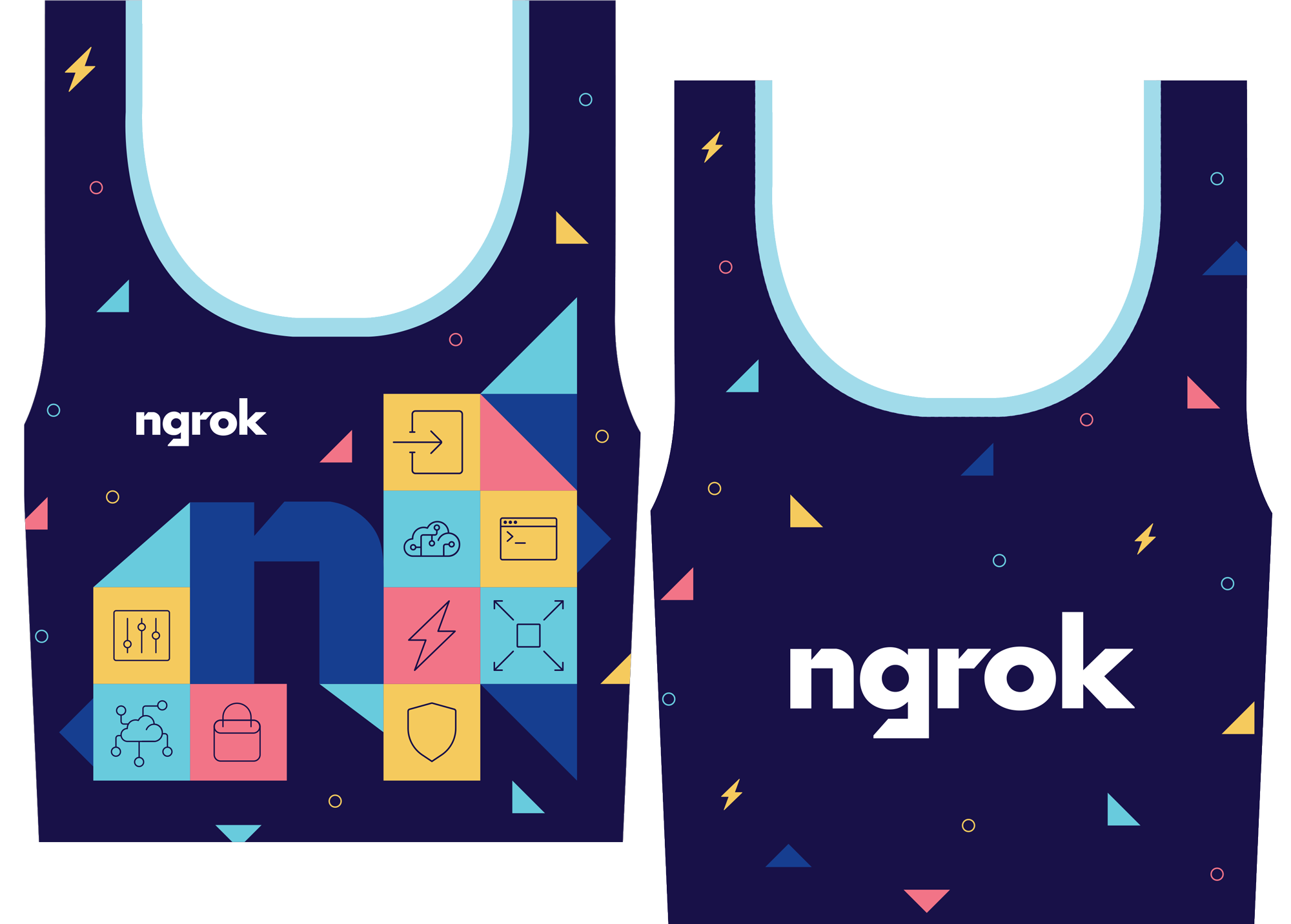
I designed this custom ngrok bag for events. It's been a hit since it folds up so small!
As the lead design contractor at Navattic, I'm responsible for the art direction and creation of many different projects. I support the Head of Marketing on data projects, LinkedIn ads, podcasts, and more. Here are a few of my favorite social projects so far.
Navattic has an awesome interactive demo product. Check them out!
I created a social promotion image for Navattic's newest webinar series. The design aligns with the webinar's goal of breaking down (but building up!) website demos. Each speaker gets to choose their own food item, which I then turn into a sticker. 🍔✨
Microservices March 2023 was our third iteration of this project, and we chose to go with a “community garden” theme to combine our previous spring theme (2021) and Kubernetes cube theme (2022). I had a great time collaborating with our stakeholders on the F5 and NGINX marketing teams and promoting cross-functional collaboration. I made sure the creative aligned with the F5 Brand, and also supported the unique needs of the developer-focused NGINX product group according to the creative brief.
I assembled the creative team and defined roles, lead creative brainstorming and alignment sessions, established space for the designers to be able to create, designed one of the theme options, presented to stakeholders and executives, and ensured all creative was approved and delivered on time.
My role: art director, lead designer, project manager
Results: 13.6k registrations (680% to goal), 17.6k YouTube views across 10 videos, 1.6k new Slack community members, and 58.6k nginx.com page views.
NGINX Microservices March is a month-long, go at your own pace virtual learning event. Each week attendees have the opportunity to read a blog, watch a webinar, and participate in a hands-on lab to learn more about microservices.
We use LucidSpark to brainstorm and document everyone’s ideas, perspectives, and feedback. I encouraged everyone to add in art and technology that inspires them. In this stage, we came up with three possible directions for the theme, and presented this to the Creative Director and entire Creative team for their take as well.
Once we landed on the possible directions, we divided and conquered three different options to present to stakeholders. Each theme had a lead designer, with illustration support when needed and constant collaboration with the core group.
I focused my design efforts on the “Structure” concept, replacing some of the cubes with different shapes to represent the complexity of microservices. The four different units could be assembled into one hero illustration (shown on the left) or stand on their own in four individual illustrations. We thought this could make for a great animation!
We landed on this “community garden” theme, designed by My Chu, which tied well to springtime and to the collaborative nature of the learning program. The green cubes represent “microservices”, and we are highlighting each unit (security, automation, apps, and observability) with bright pink isometric icons. The hero illustration features two developers, and can be broken into smaller cube groupings to highlight all units or one at a time. The cube bee, or Cubee, was a personal favorite of our team!
We utilized an existing web template and partnered with the nginx.com Product Manager and her team to launch the web experience on time.
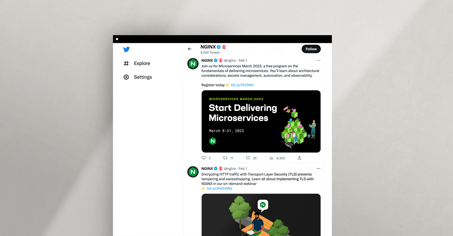
We created a consistent social media system, shown in the above Twitter example, to highlight each week’s unit and drive traffic to event registration, blogs, labs, and webinars. I kept track of which social posts were top performers, and compared engagement on static vs. animated social posts.
Email has historically been the top driver of NGINX event registration. Unfortunately, this year we were challenged by a company-wide problem that paused all email marketing. We quickly pivoted and invested more effort into social and paid media promotion instead.
We created two different stickers for developers, community members, and F5 employees to add to their laptops.
F5 NGINX Sprint is an annual virtual event that focuses on the developer community and all things open source: product roadmaps, inspiring keynotes from F5ers and industry leaders, celebrity cameos, and hands on demos. This event is meant to be fast, fun, and engaging, hence the name “Sprint”.
NGINX executives felt strongly that the visuals needed to be innovative, fun, and include cool characters, and that this should never feel like an enterprise-level event. F5 executives wanted to make sure the event still tied to the F5 brand, and didn’t go too rogue. It was my job to manage these expectations, present solutions for discussion, and utilize clear communication to get everyone on the same page.
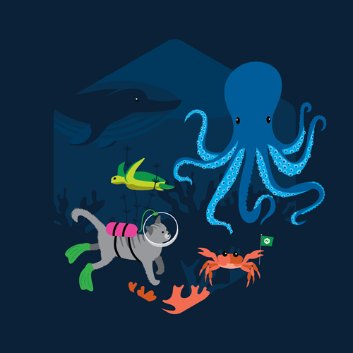
We ended up with a deep sea theme to tie into a recent F5 campaign, and I ensured that the event name was always “F5 NGINX Sprint” to include the F5 parent brand.
I assembled the creative team and defined roles, lead creative brainstorming and alignment sessions, designed a character (the crab!) and background elements, presented to stakeholders and executives, and ensured all creative was approved and delivered on time for a successful launch.
My role: art director, designer, project manager
Results: 4,711+ registrants from 3,638+ companies in 150+ countries, 3% average engagement rate on social media, and 35,527 visitors to nginx.com Sprint pages.
We knew we wanted to go with a deep sea theme, and the Sprint event leads added inspiration to a LucidSpark board to get the creative thought process started. This was really helpful because we could see what they were (and were not) looking for.
We use LucidSpark to brainstorm and document everyone’s ideas, perspectives, and feedback. In this stage, we presented this rough theme idea to the Creative Director and entire Creative team for their take as well.
Our final theme combined 6 different characters (developer with clam shell laptop, whale, Jinx the cat, octopus, crab, and turtle) swimming amongst seaweed and coral at the bottom of the ocean. This tied in well with the “Deep Dive into the World of NGINX” event tagline. The different characters and elements created a really fun design system for us to play with and adjust according to each deliverable. Each designer was responsible for one character illustration, and I created the crab! The dark blue background colors tied well to the recent F5 campaign we were referencing, but all of the green made it feel authentic to NGINX.
We utilized an existing web template and partnered with the nginx.com Product Manager and her team to launch the web experience on time.
We created a consistent social media system, shown in the above Twitter example to drive traffic to event registration, blogs, labs, and webinars. I kept track of which social posts were top performers, and compared engagement on static vs. animated social posts.
I coordinated with the Social Media manager and the Lead Animator to create an updated video template as well as thumbnails for NGINX’s YouTube channel. We changed the typical circle speaker view to a hex to match the NGINX logo shape.
We created a sticker set for developers, community members, and F5 employees to add to their laptops. We created a mixture of cut out stickers and hex-shaped stickers.
This year we created a hex-shaped scene that included all of the animal characters and printed that on navy blue tees for attendees and sweatshirts for employees. We also created socks to showcase the characters which was really fun and new for this year!
This year we were excited to add a new swag option to the mix: plushies! Here is the process of how the designers turned the Oscar (the octopus) illustration into a plushie by selecting the fabrics, textures, design inspiration, and colors (not shown). These plushies have continued to be a big hit at community events and tradeshows.
NGINX Microservices March is a month-long, go at your own pace virtual learning event. Each week attendees have the opportunity to read a blog, watch a webinar, and participate in a hands-on lab to learn more about microservices.
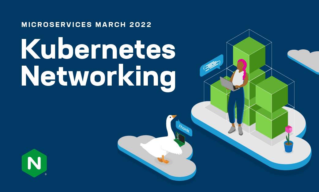
This was our second iteration of this project, and this learning program focused on Kubernetes. We came up with a friendly goose mascot to tie into the K8s community.
I had a great time collaborating with our stakeholders on the F5 and NGINX marketing teams and promoting cross-functional collaboration. I made sure the creative aligned with the F5 Brand, and also supported the unique needs of the developer-focused NGINX product group according to the creative brief.
I lead creative brainstorming and alignment sessions, led the design strategy of the main theme, presented to stakeholders and executives, and ensured all creative was approved and delivered on time.
My role: art director, lead designer, project manager
We found inspiration in Kubernetes foundations and community groups, video games, competitor and in-house F5 campaigns, and NGINX University.
I illustrated a friendly goose character in alignment with the F5 illustration library, and created four initial concepts for stakeholder review. It was important that we stayed true to F5 branding, but also to the developer community. It was my job to strike a balance.
The final theme featured a stack of cubes to represent Kubernetes containers, a developer coding on her laptop, and a secondary goose character. We chose the cloud platforms to represent cloud-native K8s and because they performed well with the same audience in a recent campaign. The dark blue background sets this apart from other NGINX social media posts, which are typically black or gray, and ties it more into F5 campaigns.
The month-long learning program includes 4 different units, centering around 4 different Kubernetes topics. We designed a unique illustration per unit, to highlight and promote each unit individually. We utilized a consistent color scheme and cohesive typography to create this system.
We utilized an existing web template and partnered with the nginx.com Product Manager and her team to launch the web experience on time.
NGINX Sprint is an annual virtual event that focuses on the developer community and all things open source: product roadmaps, inspiring keynotes from F5ers and industry leaders, celebrity cameos, and hands on demos. This event is meant to be fast, fun, and engaging, hence the name “Sprint”.
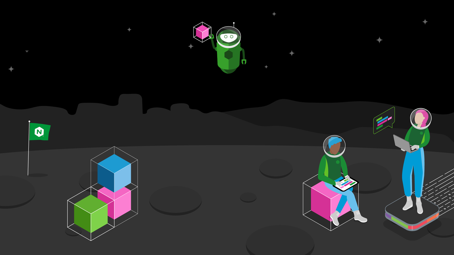
This year, the stakeholders wanted a space theme to tie to a recent YouTube video about the future of NGINX. It was important for us to tie this theme to the F5 brand, so I incorporated some key elements: the adaptive app tile that connected to a large F5 campaign, the 3d cube, and characters from the F5 illustration library. I added space helmets and boots to the human and animal characters.
My role: lead designer
Results: 68% registration increase from previous year, with 900+ companies from 120+ countries attending
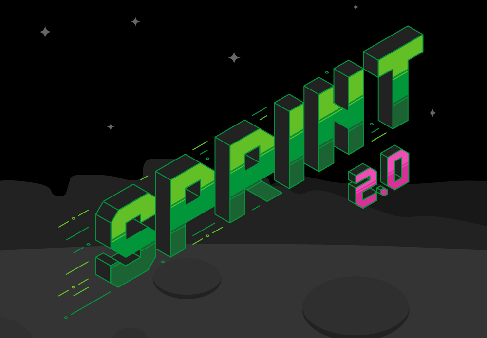
In the previous year, the background pattern was isometric. This year, for Sprint 2.0, we wanted to incorporate a little bit of the isometric fun. I drew this logo on an isometric grid and created a gradient effect with the signature NGINX greens and pinks that would be easy to print on swag. I added the lines as a nod to both speed and the traffic lines that F5 was using in campaigns at this time.
I created a simple space theme with bands of dark grays, and added texture to the surface with circles. I created the background based an abstract combination of the Seattle skyline and the Marin Hills near San Francisco (the main locations of the two teams working on this project). The characters, cubes, and robot were adapted from the F5 illustration library to fit our space theme.
We utilized an existing web template and partnered with the nginx.com Product Manager and her team to launch the web experience on time.
We tested six different posts to drive registration. NGINX Sprint Twitter posts totaled 156k impressions.
We created a series of zoom backgrounds for F5ers to use to promote the event and have fun with all the Sprint characters, like Jinx the cat.
We created one tee for attendees and employees featuring the Sprint 2.0 logo. Because the logo was created with color bands vs. an actual gradient, it was easy to print and came out great.
With the growing portfolio of products and solutions across F5 and with the introduction of F5 Distributed Cloud Services, BIG-IP hardware and software offerings, and the acquisition of NGINX, we discovered a need to drive visual cohesion across all F5 offerings in our product diagrams to simplify and clarify our portfolio for customers.
Each product group was representing products differently in diagrams. I partnered with the Director of Brand Strategy, Creative Director, three designers, and 20 Product Marketing Managers and executive stakeholders to create a solution: a new set of product icons.
These icons needed to make F5 products stand out from other icons in diagrams. We worked to establish both a color and a shape for each product group, so that if a viewer was color blind, they could still differentiate the product group based on the shape. NGINX kept their green hex shape that was already well known with customers, Distributed Cloud got a blue app tile shape to represent their cloud services, and BIG-IP got a circle with two different colors: eggplant for hardware and raspberry for new software offerings. It was important that all four colors were equally vibrant.
I worked extensively with stakeholders to gather feedback, present new solutions, and maintain equality between product groups. I coordinated feedback with designers, and reviewed their work along with the Creative Director and Director of Brand Strategy. I was responsible for keeping this cross-functional, company-wide effort moving.
My role: art director
Above you can see the system we established to give each product group has a shape and color to represent their products. We also created consistency with the actual icons. All WAF products, for example, would now use the same icon in the middle.
Above is the library of 75+ product icons we created. Even though the system looks complex, we created consistency by repeating icons where appropriate. For example, there are five different ways to deploy BIG-IP CGNAT, but the icons in the middle remain the same as it is the same product.
Here you can see a new product icon in action for F5 Distributed Cloud App Connect. In the previous diagram style, this product would have been a black icon just like all of the other technology shown in the diagram, blending in and not being clear to customers.
Above is a diagram example for the BIG-IP product group. They have many different form factors — in this case Virtual Edition (VE) — that are represented with text vs. icons.
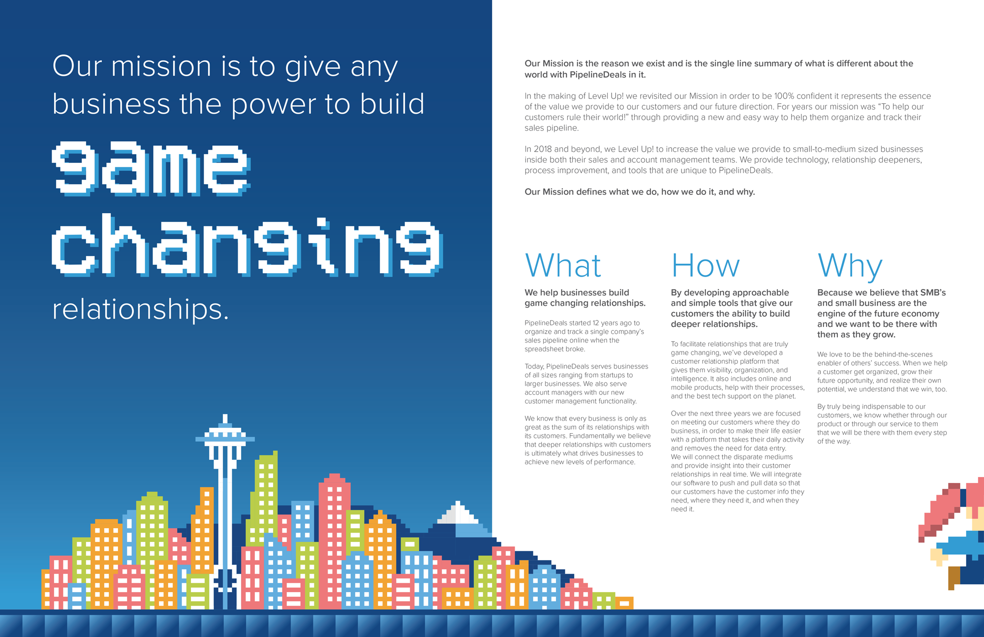
Level Up was a 3-year internal strategy centered around a new mission statement.
I collaborated with the CEO and key stakeholders for an internal communications campaign that involved a redesign of the office space, themed murals, original artwork, print creative, and professional photography.
The goal was to create excitement and turn that into dedication to the strategy and company as a whole.
I had a blast creating all the custom 8 bit art, square by square! The Mario character was altered a bit to resemble one of the sales team members.
My role: lead designer and illustrator, swag designer/coordinator
Each level represented one of the annual company summit locations. Above is Tamarindo, Skamania, and Seattle. The window clings went on meeting rooms around the office to remind everyone of the theme.
My friend Danielle and I are collaborating on a book together. This is the first of many illustrations!